Tuesday, March 10, 2015


3 Page Type only Advertising Ad

         This past weekend was an absolute horror as far as finding time to get work done. Emergency after emergency that carried into Monday. Anywho, today we have a type only, with the company logo authorized, ad for our chosen logo. The point is to have the viewer be able to figure out what the message is saying. You don't see them that often, when it comes to ads, which portray a twisted version of taking out the competition. Not sure what happened with the third one when they all saved as a .jpg. It is obvious that a section has been warped. I am pleased with the results of this project.

Sunday, March 1, 2015

Controversy

         So we have had a very productive week. Friday was amazing. I ended up at a sports bar for lunch with one of my business partners and our investor. Well, let's just say that next weeks blog could have some exciting news. Anywho, in my Graphic Symbolism class I was instructed to design a project of four different photographs. With each image I was to apply an effect on each image then take all the images and create an overall design. The images are: and forest with a stone path running through it which I apply a emboss to give it a metallic look, the photograph of some green aurora in the north pole area with a rippled glass effect, a photo shopped image of a pot leaf made of fire of which I altered the color, and finally a photograph of a flower and it's large leafs which I applied a watercolor effect. The base image is the forest with full opacity and the other three images have been placed on top of each other, and the opacity of each image was adjusted until I felt the concept was complete and the artistic piece was ready to be viewed. One of my professors thoroughly enjoyed the look of this project and was wanting to place it in the school show case; however, due to the controversy of the subject matter he did not, in order to save all parties involved from a waste of their time and energy.

Monday, February 23, 2015


Graphic Design company's Logo


          Today I picked to place the logo I designed for a company I am creating in my Professional Development Class. This past weekend I was able to get a lot accomplished including changing the look of the logo for Monster GraFX, LLC. This was quite difficult to find a type and style in which to make the "Gra" part of the logo name. I finally have gone with a 3D effect with a bevel added. This allowed me to add the matching colors and keep the FX effect.

Tuesday, February 17, 2015

Movie Satire Poster

Paws the movie

 
           This past week has been a bit better. What we have today is a movie satire design of mine. I have always been a fan of the movie Jaws and I love humor; therefore I went for the all terrifying move "Paws." I bat around a few ideas, however the daily humor in households around the world deal with this style of "movie" all the time. I grew up with cats and own two now. We also grew up with fish in the house as well. Time and time again my family and I would find the cats sitting right next to the big fish tank enthralled with all the fish swimming around in hopes of getting one of them. Just like the movie the cat always ended up loosing in my house too.

Tuesday, February 10, 2015

Fictional Logo Design


Potential basketball team for a college


          Well so far this past week has been quite a difficult one for me. I am down to my last two quarters of my degree program and the classes are starting to get to me really bad because I am taking 4 of them and they are all quite involved. Today I have posted a logo I designed for a potential basketball team of a college. Coming up with something was not too hard for me because I love dragons. The hardest part of the whole design was getting the outlines to work properly so that the color will hold in place. Most of my fellow students said how much they like the way the logo looks overall.

Tuesday, February 3, 2015

Difficult Week

     This past week has been especially difficult for me. I have been feeling quite overwhelmed with all the classes and the amount of projects that I must work on. As of this very moment I do not have anything that I feel is worthy to be shown. I am currently working on a few things in the classes that I am in and will hopefully have something nice to place up for next week. The process of coming up with different concepts for each assignment is very difficult now however I feel as if I can find some inspiration from the different sights around me. Creativeness is a process that can sometimes be slow and hard to realize what your supposed to come up with. Well I guess I shouldn't leave you totally empty handed. Therefore, I have placed a Photograph that I took. It is one of the best shots that I had done in my photography class and my professor really liked the look of it himself.


Saturday, January 24, 2015

Field of Vision diagram

Visual Map Diagram

          The purpose of this project was to show the information, without the added text, abd explain the exact process of which you the designer wants to portray. I decided to demonstrate the different potential field of vision losses. Using color coordination shows the area of the visual pathways that is/are affected when the black areas of vision are seen on a visual field test readout. One of the Optometrists that I work with was very impressed by how professional the diagram looks as well as the complete accuracy of the project's overall design.

Tuesday, January 20, 2015

Cliche'

"Money Hand Over Fist"

          In my Graphic Symbolism class we were giving the assignment to create visually a cliche' of our choice. First thoughts were the hand over fist cliche'. The creation of the money hand was extremely difficult to pull off and went through many variations of the design. This particular piece was also placed in the college art display area.

Wednesday, December 10, 2014

Collateral Design Poster

Interactive Poster

          In Collateral Design class I was instructed to make an interactive poster for the Alaska Zoo Experience. The background photograph was taken by myself. The bald eagle and the glove were carefully selected from images I retrieved from ThinkStock.com using Adobe Photoshop then placed into the composition. The black hole next to the glove is designed to be cut out so that the patron of the zoo can place their arm into it and a photograph can be taken making it appear they are actually catching a bald eagle. My professor said the selected image of the eagle was so well done that he can't tell it was place in the image.

Wednesday, December 3, 2014

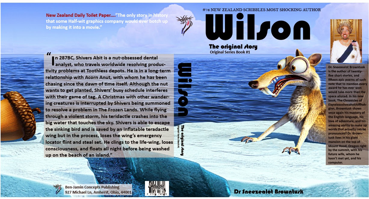
Potential Book Series


The Original Story Series

         In my Collateral Design class we were asked to come up with a book series which could be done in three books. Well, as the type and style of books was left up to the imagination of the graphic artist, I opted to create spoofs on original stories for humor purposes. The entire covers are fabricated with details you would see in an actual book with all the type being readable. A large majority of books you find on the shelves of stores are sort of similar in the layout of the type. The difficult part was to place the desired image on the cover that would allow for a seamless look to the cover when laid out flat. I must agree with my professor that "Wilson" is by far the best story-line out of the three. However, he was very impressed with the overall look of the book series.