Tuesday, February 10, 2015

Fictional Logo Design


Potential basketball team for a college


          Well so far this past week has been quite a difficult one for me. I am down to my last two quarters of my degree program and the classes are starting to get to me really bad because I am taking 4 of them and they are all quite involved. Today I have posted a logo I designed for a potential basketball team of a college. Coming up with something was not too hard for me because I love dragons. The hardest part of the whole design was getting the outlines to work properly so that the color will hold in place. Most of my fellow students said how much they like the way the logo looks overall.

Tuesday, February 3, 2015

Difficult Week

     This past week has been especially difficult for me. I have been feeling quite overwhelmed with all the classes and the amount of projects that I must work on. As of this very moment I do not have anything that I feel is worthy to be shown. I am currently working on a few things in the classes that I am in and will hopefully have something nice to place up for next week. The process of coming up with different concepts for each assignment is very difficult now however I feel as if I can find some inspiration from the different sights around me. Creativeness is a process that can sometimes be slow and hard to realize what your supposed to come up with. Well I guess I shouldn't leave you totally empty handed. Therefore, I have placed a Photograph that I took. It is one of the best shots that I had done in my photography class and my professor really liked the look of it himself.


Saturday, January 24, 2015

Field of Vision diagram

Visual Map Diagram

          The purpose of this project was to show the information, without the added text, abd explain the exact process of which you the designer wants to portray. I decided to demonstrate the different potential field of vision losses. Using color coordination shows the area of the visual pathways that is/are affected when the black areas of vision are seen on a visual field test readout. One of the Optometrists that I work with was very impressed by how professional the diagram looks as well as the complete accuracy of the project's overall design.

Tuesday, January 20, 2015

Cliche'

"Money Hand Over Fist"

          In my Graphic Symbolism class we were giving the assignment to create visually a cliche' of our choice. First thoughts were the hand over fist cliche'. The creation of the money hand was extremely difficult to pull off and went through many variations of the design. This particular piece was also placed in the college art display area.

Wednesday, December 10, 2014

Collateral Design Poster

Interactive Poster

          In Collateral Design class I was instructed to make an interactive poster for the Alaska Zoo Experience. The background photograph was taken by myself. The bald eagle and the glove were carefully selected from images I retrieved from ThinkStock.com using Adobe Photoshop then placed into the composition. The black hole next to the glove is designed to be cut out so that the patron of the zoo can place their arm into it and a photograph can be taken making it appear they are actually catching a bald eagle. My professor said the selected image of the eagle was so well done that he can't tell it was place in the image.

Wednesday, December 3, 2014

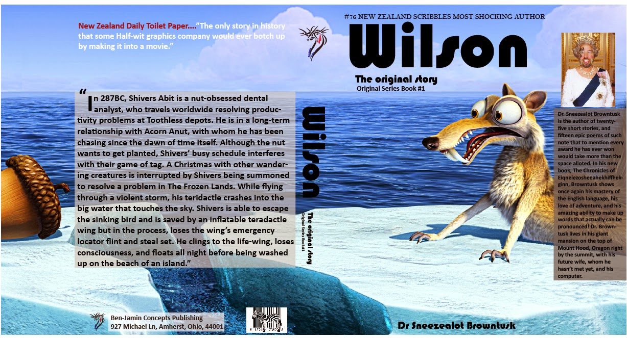
Potential Book Series


The Original Story Series

         In my Collateral Design class we were asked to come up with a book series which could be done in three books. Well, as the type and style of books was left up to the imagination of the graphic artist, I opted to create spoofs on original stories for humor purposes. The entire covers are fabricated with details you would see in an actual book with all the type being readable. A large majority of books you find on the shelves of stores are sort of similar in the layout of the type. The difficult part was to place the desired image on the cover that would allow for a seamless look to the cover when laid out flat. I must agree with my professor that "Wilson" is by far the best story-line out of the three. However, he was very impressed with the overall look of the book series.


Wednesday, November 26, 2014

Drawing Magazine


Magazine Remake

        The assignment I was given was to remake an actual magazine in order to potentially attract a newer different style of clientele. All aspects of the remake must be actual content from the real magazine. Bellow you will see the copies of the Cover, Content, and Article pages. The above is my version of what I feel the new look should be. Changing the font style of the name was important as it grabs the reader's attention therefore I wanted a font style that was bold enough yet allow for the rest of the name be just as drawing as the initial letter. Adding the drop shadow allows for the name to "jump" out at the reader in a playful manner. I feel as though the font families I used and the more organized flow of the content page as well as the Article page lets the reader find the material with more free flowing line of sight.


Wednesday, November 19, 2014

Logo Design


     The purpose of this composition is to create a logo for a potential local company. I choose the Columbia Cannons. I was instructed to make the logo using the gestalt method. I felt that an old cannon would work perfectly due to the bulkiness of them. Adding the soccer player doing a bicycle kick at the base where the wheel would be just seemed natural. The goal I had in mind was, that the  over all message you take away from the image is that the members of the team have kicks that are like a cannon propelling the soccer ball to it's destination. Adding the type was a challenge but found that angling the type to follow the direction of the cannon gave the entire logo a more box look while counteracting the curves throughout the image.

Monday, November 10, 2014

Resort Branding Campaign


 Bonne Terre Dive Resort Logo Design

          The campaign you see here is the total creation of a fictional resort that has the potential to be a reality however not as of yet. The purpose of this particular exercise was to create a new look on an existing resort. The most difficult part of the entire project was coming up with the logo itself. I sketched out many different ideas. I actually created and recreated the logo many times over. It came down to simplicity. Placing the diver's silhouette at the base was an easy choice however coming up with how it would interact with the type was a bit of a challenge. What makes the logo it's overall look is the type. I spent many hours going through different fonts and families and then had to find the proper balance of the two words. My professor said that it was a well designed logo that was simplistic with an inviting look.


Saturday, November 1, 2014

Photoshop colored illustration

Chinese Dragon

         This particular illustration started out as a drawing of mine. I drew the outline of the dragon using a pencil. After the outline was completed I took the drawing and scanned it in order to be able to manipulate and enhance the piece using the Adobe Photoshop program. Using different filters and effects added to the color in order to create a design which when printed makes you want to feel the illustration because it appears to have texture. Each scale was painted individually as well as the skin that fills the empty spaces between the scales. I left the hair of the dragon as it looks when scanned; which gives the dragon an older look due to the grey look of the pencil marks of the hair. Once again I am using a different program to show how each and every graphic design programs can be used to achieve a colored illustration with digital texture. The department chair of South University's Design Degree program told me it was an extremely nice piece that could I should make sure stays in my portfolio.